10 Must-Have Features for a High-Converting Homepage
-1.png?width=770&name=Copy%20of%20MM-BlogBanner-Blog%20(1)-1.png)
The homepage of your website is like your business’s front door. It’s responsible for drawing in the majority of your website traffic and creating a good first impression.
Whether you’re considering a website redesign or looking to generate more leads from your website, it’s a good idea to start with your homepage.
A homepage has to serve multiple purposes and audiences at once. It needs to attract new prospects, engage leads with educational content, and delight customers who are ready to buy.
Visitors to your website homepage ask various questions:
- Am I in the right place?
- Do you have the product I’m looking for?
- How can you help me?
- I have a question. Can I ask you?
- Can I trust you?
If your homepage can successfully answer these questions and provide visitors with the information and resources they need, then they are more likely to make a positive decision.
Consider your ideal customer, their buyer’s persona and where they are in the customer value journey. This will make a difference in what they are looking for in your homepage.
Striking a balance between having a clean, innovative design and providing detailed information about your products or services can be a challenge.
There’s a lot of pressure on your homepage to perform. A poor homepage will make visitors leave your site for a competitor, fast.
So, what features does a homepage need?
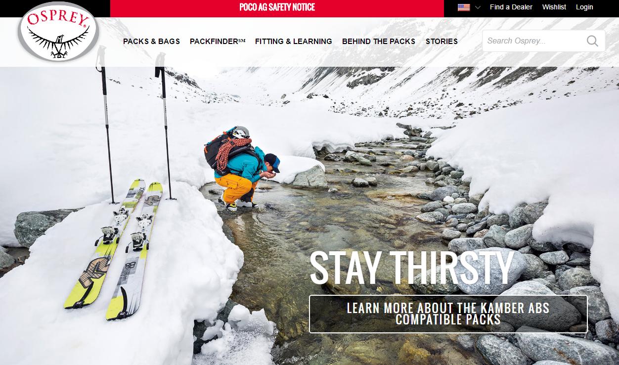
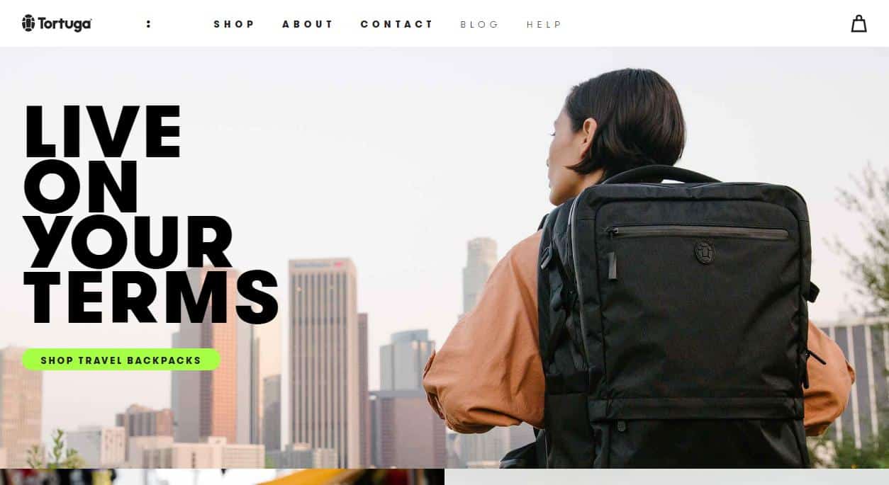
- Headline: A headline must tell visitors what you have to offer, within 3 seconds. Keep it simple and appeal to your audience’s pain points.
- Sub-Headline: Your sub-headline supplements the headline by describing what you offer. Aim for a single sentence. Also try to resonate with pain points and how your products can solve them.
- Calls to Action: The goal of your homepage is to convince users to explore more of your website and move down the funnel. Make sure your CTAs are visible and have a clear action. Examples include ‘Sign up here’, ‘Go’, ‘Grab your free trial’ etc.
- Visuals: Include visually strong images and videos to appeal to your users. It could be of your products or services, or evoke how your customer will feel after purchasing your product.

- Benefits: Describe what makes your brand unique and how your products will benefit your customers. Appeal to your customers with simple language, easy to follow layout, and leaving white space.
- Features: List some of the key features of your products or services. Keep it simple and easy to read and avoid jargon. Don’t overload your homepage with details, instead include a link to your product page for more info.
- Social Proof: Social proof builds trust with your visitors. Include reviews, testimonials, customer stories, and links to case studies on your homepage. Adding a name and photo to these quotes can give more credibility.
- Clear Navigation: Having easy navigation on your homepage is critical to reduce customers bouncing. Make sure the layout is simple and clear, and that the links and buttons work. Make a navigation menu clear at the top of the page and organise links in a hierarchical structure.
- Lead Magnet: Not everyone who visits your homepage will be ready to buy yet, so including lead magnets is a great way to reach them. This could be a simple pop-up that appears when the viewer has been on the page for a certain time. Examples include reports, ebooks, guides, cheat sheet, checklist, toolkit, workbook, worksheet, video, podcast and so on.
- Company Success Stories: Has your company won any awards or recognition? Have you worked with any well-known brands or people? Highlight your achievements on your homepage to build credibility and social proof for new visitors. Also tell your company story and any employee success stories to further build a positive image of your brand.

What makes a high-converting homepage?
A conversion rate is the percentage of website visitors who complete a desired action. Conversion rate is calculated by dividing your number of conversions by your number of visitors and multiplying that number by 100 to get the percentage.
Conversion rate optimization, or CRO, is the process of enhancing your website and content to boost conversions. A high conversion rate means your website is well-designed, formatted effectively, and appealing to your target audience.
To craft a high-converting homepage, you need to optimise to give the user the best experience and reduce friction. Give the user clear goals and step out actions for them to complete. Remember that not every visitor is on your homepage for the same reason, and so try to set it up for varying purposes.
According to Digital Marketer, every homepage must:
- Present your company (but focus on visitors)
- Focus on visitor’s needs across a wide range of customer value journey
- Address a variety of customer interests in a short timespan
- Communicate core information about your services
- Have a familiar design, layout and feel but also be unique
For your homepage, optimise for conversions through:
- Using simple language
- Reducing friction
- Making CTA prominent & free
- Linking to product info
- Using a live chat or chatbot to answer customer questions
- Testing regularly
So, now you know the 10 must-have features for a high-converting homepage, it’s time to take a look at your website. Have a think about what are you doing well, and what can you improve to get those conversions soaring.
Looking to supercharge your website and digital marketing efforts? Margin is here.


